I am an avid user of LinkedIn. Not only does it replace those business cards I used to lose all the time, but it is also a great way to find people. As part of my practice, I often have to track down inventors that used to work at one of my clients’ companies, but have long departed. LinkedIn has been amazingly useful for this. It is sometimes frustrating that certain features I really would like don’t exist. But I still do try to connect with everyone I have professional relationships with.
This leads to a very interesting LinkedIn network. The LinkedIn network is a project at LinkedIn Labs, and it shows you how the people you are connected are connected to each-other.
My map is rather weirdly disconnected.
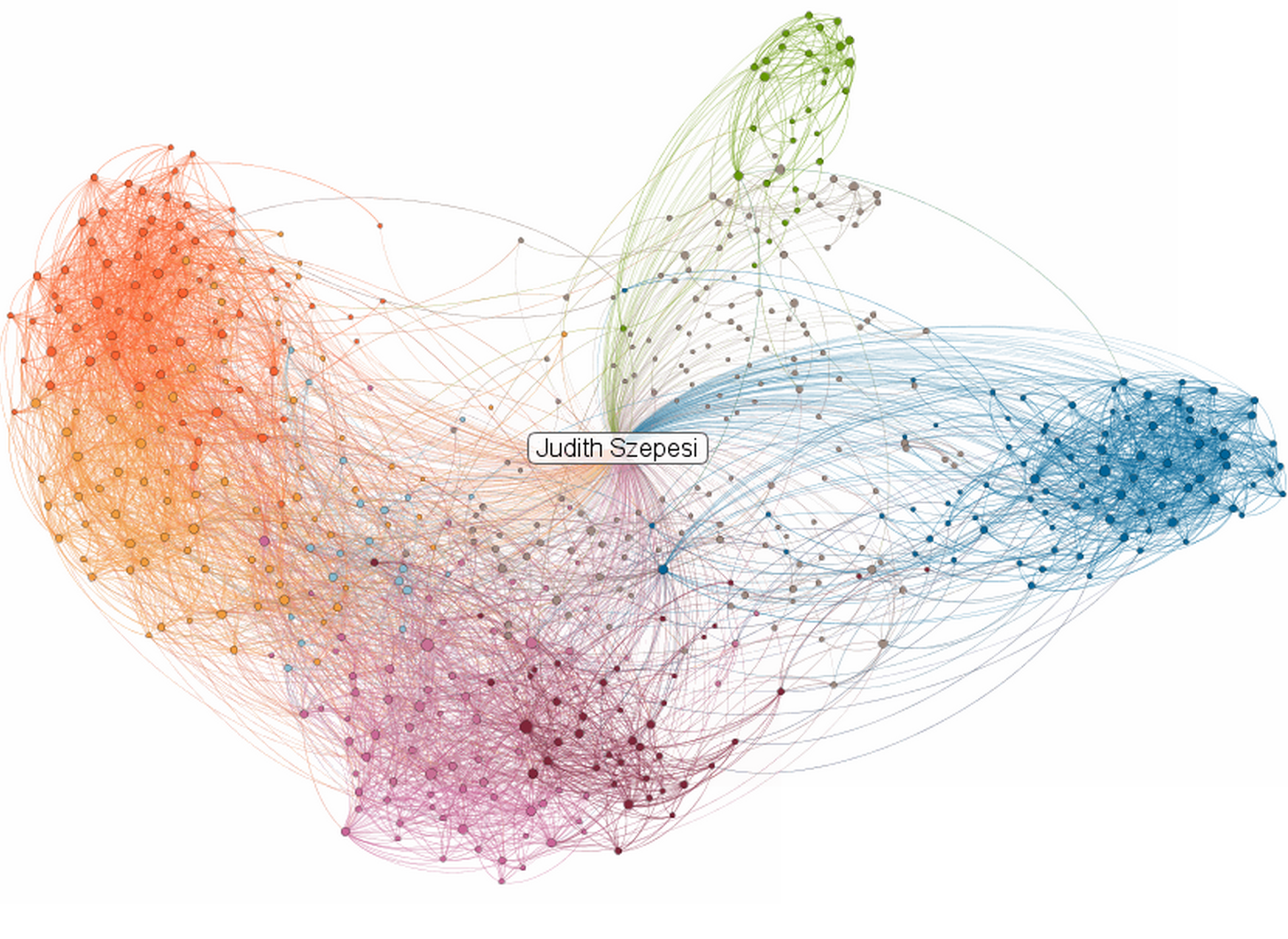
It looks like I have four almost completely independent sub-networks. This isn’t entirely untrue. The orange represents my colleagues at my former firm, and those strongly connected to them. The blue are my old friends. They are almost entirely unconnected as networks. Oddly, the green are my clients, who tend not to be connected to either friends or former colleagues. And the group that is most connected with the others is the purple, which is the women’s network that grew out of WiLPower and TheCLUB, both organizations that help professional women develop their careers.
I attend WilPower many years ago, and stayed connected to the group. And, it appears, the group is also connected to my (mostly male) former colleagues and my friends circle as well.
What story does your LinkedIn network tell?